Wednesday, September 23, 2026 | 5 minutes
Why do London buses stop so frequently?
The hypothesis
“Why do London buses stop so frequently?” This question had been bumping around my head for a few weeks now. Since moving, I take the bus more often than the tube, and one thing I’ve noticed is that, on certain bus routes, it feels like I spend more time waiting at stops than actually travelling between them. And it doesn’t seem that it’s because they spend an excessive time at each stop - it seems to be due to bus stop proximity. It’s not uncommon that you can see one bus stop from the next. I understand this can benefit those with reduced mobility, but the tradeoff is, presumably, taking a bus significantly longer to traverse its route.
But this is just a hypothesis - that bus stops in London are geographically very close together. Fortunately, TfL provides a huge amount of data, making this analysis pretty straightforward. And Streamlit makes it simple to build a dashboard.
The findings
You can see the dashboard here: https://tflbus.streamlit.app/statistics
Based on the all-London TfL snapshot:
| Metric | Q25 | Median | Q75 |
|---|---|---|---|
| Spacing (m) | 218 | 285 | 365 |
| Driving time (min) | 1 | 1 | 2 |
| Walking time (min) | 2.9 | 3.8 | 4.9 |
| Stops/km | 2.7 | 3.1 | 3.3 |
| Stops/mile | 4.3 | 4.9 | 5.3 |
Walking time is based on 4.5km per hour walking speed. The driving time is based on the schedules, to the nearest minute - so, if a bus is expected to stop at two stops within the same minute (which happens), the driving time is given as 0 minutes (instead of, say, 30 seconds).
Network-wide minimums and maximums don’t tell us much, so I’ve excluded them here. Often the minimum is based on a turnaround or bus repositioning, which is marked as two stops. I could filter these out, but that is a lot of work for this little project. Similarly, the max spacing of several kilometres relates to the Superloop routes.
So, the median is what we care about. Median spacing between stops is 285 metres, which is only about 1 minute driving time, or 4 minutes walking time. The median stops per kilometre is 3.1 (that’s 4.9 per mile).
The interquartile (Q25 to Q75) range tells us the spread of this data - 50% of consecutive stop pairs fit between these values. 75% of consecutive stop pairs are under 5 minutes walk from each other, being 365 metres or less.
Which routes are the “worst offenders”?
The 389 (depending on direction) has 6 stops per km, with a median spacing of 146 metres; 75% of consecutive stop pairs are 217 metres apart or below, and the max is only 337 metres - that’s only 4.5 minutes walking. Admittedly, this is a short route, with only 14 stops over 2.4~2.9km.
The average route is 14.2km over 39 stops, so a representative one is the 300 - 12.2km and 47 stops. The minimum spacing is only 80 metres (just over a minute walking), with 75% being 279 metres (sub 4 minutes) apart.
Neither of these go through the city centre; one that does is the 243. 62 stops over 15.7km, starting/ending at Waterloo and going through the City and Old Street area. Median 264m (3.5 mins walk), 75% are 324m (4.3 minutes walk) apart.
You get the idea.
To show it visually, here is a histogram:
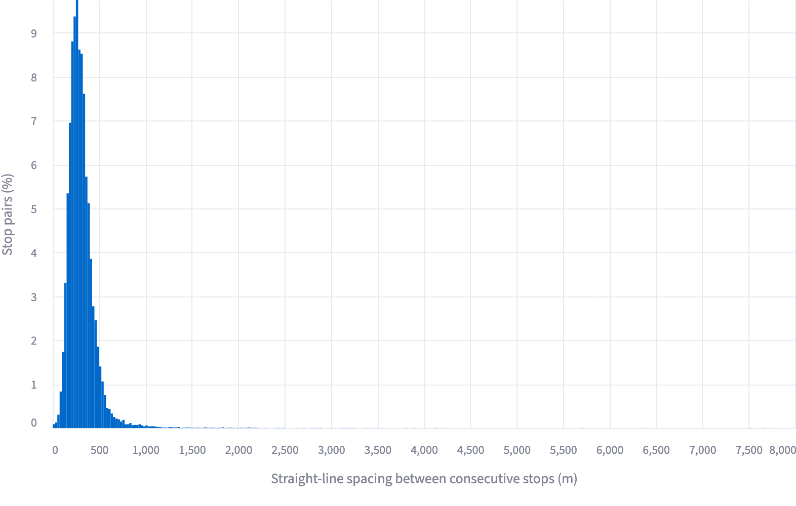 The peak, covering 9.7% of consecutive stop pairs, is 250-275m. Overall, 77% of consecutive stop pairs would take 5 minutes or less to walk between (375 metres).
How does this compare to other cities? A similar analysis of Paris gave:
| Metric | Q25 | Median | Q75 |
|---|---|---|---|
| Spacing (m) | 286 | 406 | 689 |
| Driving time (min) | 1 | 2 | 2 |
| Walking time (min) | 3.8 | 5.4 | 9.2 |
| Stops/km | 0.7 | 1.5 | 2.4 |
| Stops/mile | 1.1 | 2.4 | 3.9 |
Paris stops are, at the median, about 40% further apart than London, taking double the time to drive between (although possibly not, given the round-to-nearest-minute data caveat), and about 50% further to walk between (albeit still a very manageable 5mins). Median stops per km (mile) is 1.5 (2.4) - fewer than half. Their Q25 is our median.
And Berlin?
| Metric | Q25 | Median | Q75 |
|---|---|---|---|
| Spacing (m) | 279 | 365 | 471 |
| Driving time (min) | 1 | 1 | 2 |
| Walking time (min) | 3.7 | 4.9 | 6.3 |
| Stops/km | 2.2 | 2.6 | 2.8 |
| Stops/mile | 3.6 | 4.1 | 4.6 |
Like Paris, Berlin has higher medians than ours, and a Q25 similar to our median.
Caveat: these are not perfectly comparable, as the Paris data covers the wider Île-de-France network, and the Berlin data covers the smaller area covered by BVG buses.
The answer
OK, I didn’t answer the question “why” - only TfL knows. But the hypothesis that London bus stops are geographically close together seems true - and they seem to be closer than comparative cities. How this affects overall journey times would require other data, such as traffic, passenger numbers, and the time spent at each stop. If I ran TfL I’d be interested in testing some express bus services, where the minimum spacing between stops is, say, 500m - quick research suggests London has a lower-than-average share of express bus services. I’d also make it you can transfer between buses and tubes without being charged twice, as almost every other major world city does… But that’s a separate discussion!
Bonus: route mapping, area exploration, and point-to-point routing
Doing this analysis required getting all the bus routes. Given I had this data, I thought I’d make some fun extra tools which, strangely, do not seem to be readily available elsewhere.
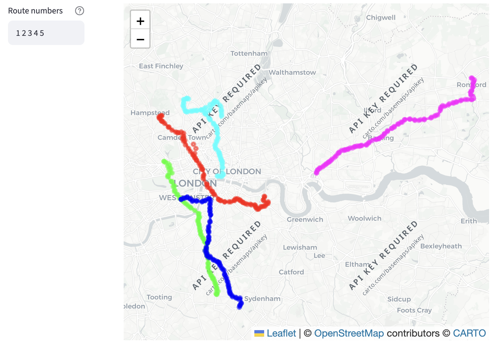
First, enter the route numbers, plot them on a map: https://tflbus.streamlit.app/route_map
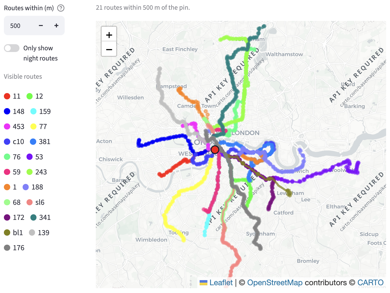
Second, explore: put a pin on the map, see all the nearby bus routes, and hence see where you could end up: https://tflbus.streamlit.app/explore
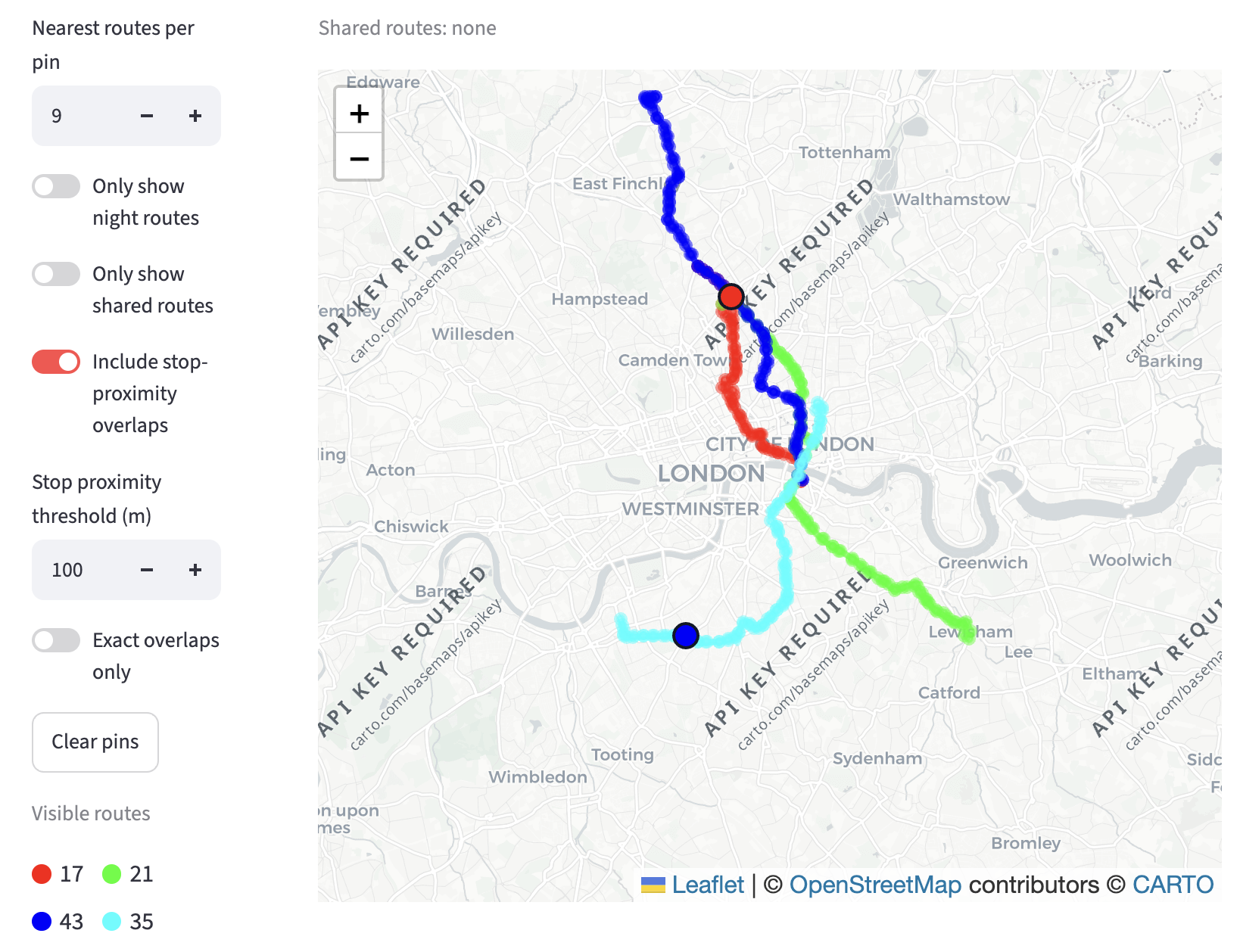
And third, add two pins, and see which bus routes serve both locations: https://tflbus.streamlit.app/go