
Saturday, May 16, 2026 | 10 minutes
Fraud Detection Console using IEEE Dataset
Introduction
The dashboard is hosted on Render’s free tier: https://ieee-fraud-detection.onrender.com/ (it can take a minute or so to load first time).
The data
I used the IEEE-CIS Fraud Detection dataset from Kaggle: https://www.kaggle.com/competitions/ieee-fraud-detection/ Of all the fraud-related datasets I found, this seemed one of the most complete, with over half a million rows of data and hundreds of features.
The analysis
As usual, I used a Marimo notebook. I imported the data and merged the transaction and identity data on the Transaction ID. I also added a column has_identity, as only about a quarter of the transactions had identity data. This keeps identity coverage as an explicit signal, rather than hiding it inside lots of missing identity fields.
The main purpose of this project is to build a dashboard, not get the perfect model, so I didn’t go incredibly deep into EDA and feature engineering, looking into cross-correlations etc. However, I did make a large analysis table with a bunch of stats. There are 14 “core” features (transaction amounts, product codes, card details, address info, distance info, and email info), hundreds of “additional” features (masked counts, timedeltas, match flags, and Vesta-engineered numerical features), and a few dozen identity features (mostly masked, plus some device info). Here’s a selection of some of the more interesting columns:
| column | dtype | unique_values | missing_pct | sample_values |
|---|---|---|---|---|
| TransactionAmt | float64 | 20902 | 0 | [“68.5”,“29.0”,“59.0”,“50.0”,“49.0”] |
| card1 | int64 | 13553 | 0 | [“13926”,“2755”,“4663”,“18132”,“4497”] |
| card4 | str | 5 | 0.3 | [“discover”,“mastercard”,“visa”,“american express”] |
| addr1 | float64 | 333 | 11.1 | [“315.0”,“325.0”,“330.0”,“476.0”,“420.0”] |
| P_emaildomain | str | 60 | 16 | [“gmail.com”,“outlook.com”,“yahoo.com”,“mail.com”,“anonymous.com”] |
| C1 | float64 | 1657 | 0 | [“1.0”,“2.0”,“4.0”,“6.0”,“127.0”] |
| D8 | float64 | 12354 | 87.3 | [“83.0”,“26.0”,“21.0”,“29.0”,“189.0”] |
| M4 | str | 4 | 47.7 | [“M2”,“M0”,“M1”] |
| V313 | float64 | 5530 | 0.2 | [“0.0”,“90.3279037475586”,“29.0”,“226.0”,“49.0”] |
| column | mode | mode_pct | min | max | mean | median |
|---|---|---|---|---|---|---|
| TransactionAmt | 59 | 5.2 | 0.251 | 31937.391 | 135 | 68.8 |
| card1 | 7919 | 2.5 | 1000 | 18396 | 9898.7 | 9678 |
| card4 | visa | 65.3 | ||||
| addr1 | 299 | 8.8 | 100 | 540 | 290.7 | 299 |
| P_emaildomain | gmail.com | 46 | ||||
| C1 | 1 | 53.6 | 0 | 4685 | 14.1 | 1 |
| D8 | 0.7916659713 | 1.8 | 0 | 1707.7916259766 | 146.1 | 37.9 |
| M4 | M0 | 63.5 | ||||
| V313 | 0 | 83.1 | 0 | 4817.4702148438 | 21.4 | 0 |
| column | fraud_rate_when_present | fraud_rate_when_missing | missing_fraud_gap |
|---|---|---|---|
| TransactionAmt | 0.035 | ||
| card1 | 0.035 | ||
| card4 | 0.035 | 0.026 | 0.009 |
| addr1 | 0.025 | 0.118 | 0.093 |
| P_emaildomain | 0.036 | 0.03 | 0.006 |
| C1 | 0.035 | ||
| D8 | 0.104 | 0.025 | 0.079 |
| M4 | 0.05 | 0.019 | 0.031 |
| V313 | 0.035 | 0.036 | 0.001 |
| column | non_fraud_median | fraud_median | median_fraud_gap |
|---|---|---|---|
| TransactionAmt | 68.5 | 75 | 6.5 |
| card1 | 9711 | 9633 | 78 |
| card4 | |||
| addr1 | 299 | 299 | 0 |
| P_emaildomain | |||
| C1 | 1 | 2 | 1 |
| D8 | 50.583 | 2.667 | 47.916 |
| M4 | |||
| V313 | 0 | 0 | 0 |
Hard to interpret directly due to the masking. Some of the outliers are interesting; for example, D7 implied fraud 15% of the time, and several of the Vesta features implied fraud at 17% when the value was missing (the overall fraud rate is 3.5%). The largest median fraud gap (the delta between the fraud median and non-fraud median) was over 25,000, although this was for a column with values from 0 to 1,000,000; another column, with a min-max range of only 129, had a relatively larger gap of 59. Separately, missingness itself was often informative: for some columns, rows with missing values had a much higher fraud rate than rows where the value was present. The number of values per column varied from 2 to 590,540, and columns varied from having no missing values to over 99% missing.
Next, I grouped the columns by type and transaction/identity, then did a train_test_split to get ready for modelling. I stratified on isFraud, as the dataset was only 3.5% fraud; without stratification, the train and holdout sets could have ended up with slightly different fraud rates, making the evaluation less reliable. I kept 20% as the test data, which will be the holdout set for the online dashboard.
The columns needed some minor preprocessing, so I used a ColumnTransformer with pipelines for the numeric and categorical features. The numeric pipeline has a SimpleImputer and a scaler (which is needed for the logistic regression). The categorical pipeline converted each to strings (as some “categories” were just numbers, and it caused issues), and OneHotEncoder to turn the columns from long to wide.
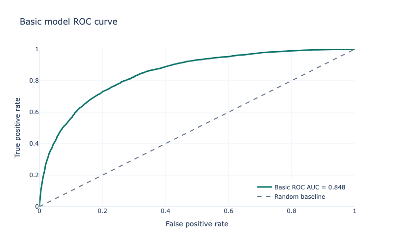
Now, the models. The basic pipeline used a simple LogisticRegression, with class_weight="balanced" as fraud was far less common than not fraud. The basic pipeline only uses the basic 14 features. I used StratifiedKFold (again due to the imbalance), and cross_validate to see how good it was, scoring based on ROC AUC, average precision, accuracy, precision, recall, and F1. The results were not great; while ROC AUC was 0.85 and accuracy was 0.79 and recall was 0.73, average precision was only 0.22 and precision 0.11, with F1 at 0.19. The numbers were similar for the holdout data. This means that while it did catch most fraud, it also incorrectly predicted a lot of non-fraud as being fraud. In real life, this could mean blocked transactions and unhappy customers, or a huge requirement for human review.
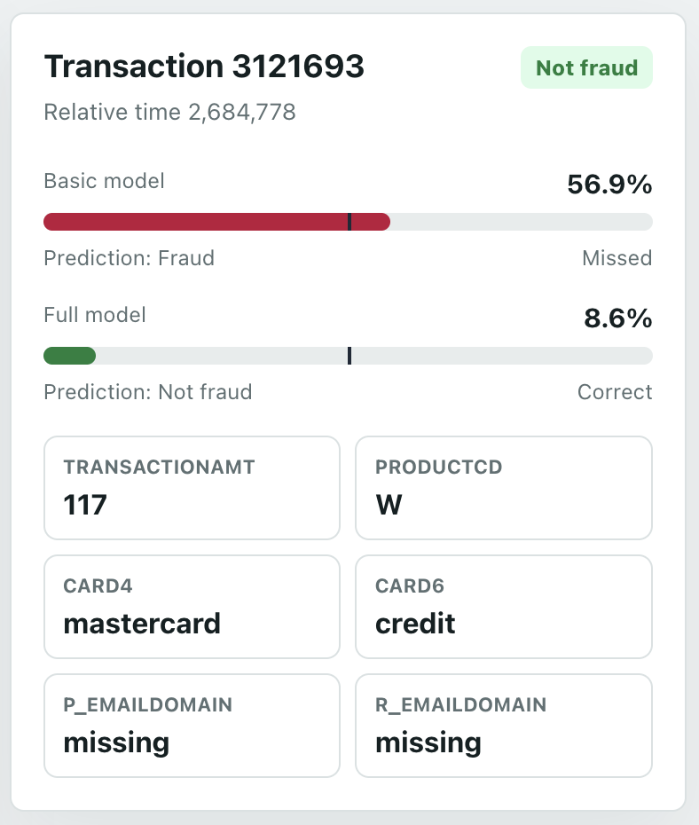
Not great, as expected - a simple model with a few features. You can see on the dashboard Transaction tab how it incorrectly assigns many items.
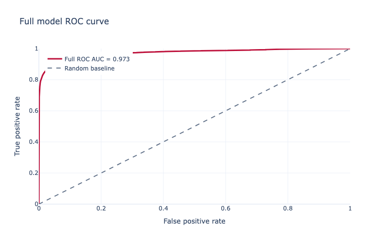
So, a more complex model. I expected an XGBoost model to work well because this is a large, messy, missing-heavy tabular dataset, with lots of non-linear interactions that a simple linear model is unlikely to capture. I also used all the modelling features, excluding the target and transaction ID/time columns. As an evaluation metric I used aucpr because the dataset is heavily imbalanced: only 3.5% of transactions are fraud, so precision-recall performance is more informative than accuracy. For the tree method I used hist, XGBoost’s histogram-based algorithm, because it is faster and more practical for a dataset with hundreds of thousands of rows and hundreds of features. Again, StratifiedKFold and cross_validate. In XGBoost you can use scale_pos_weight to balance the data, which I did. I also tried a BayesSearchCV; however, I had to reduce the number of estimators from 5000 to 500 to make it not take weeks to run on my laptop, and, because of this, the basic non-search high-estimator one performed best. Results were much better: ROC AUC of 0.97, accuracy 0.99, recall 0.74, average precision 0.83, precision 0.84, and F1 of 0.78. Holdout data was similar. These differences can clearly be seen on the dashboard Overview tab.
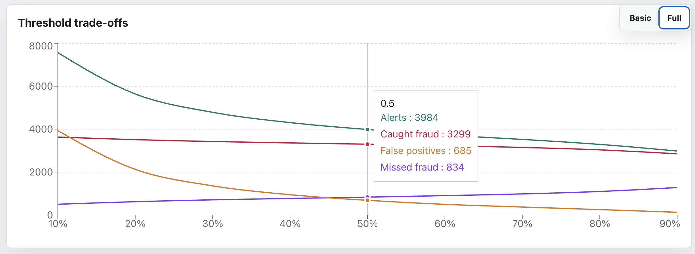
The next question is at what threshold we consider it fraud - the default is 50%, but that may not be ideal. The basic model was too bad for this to even matter. However, for the full model, which performs well, the threshold is an important business decision - the trade-off between caught fraud, missed fraud, and false positives. For example, at 10%, we catch almost 90% of all fraud - but we still get more false positives than true positives. On the other end, 90%, only about 70% of fraud is caught (so over 1000 cases are missed), but we only get about 100 false positives. The dashboard graph makes these trade-offs more visible; a potentially good balance seems to be at around 70%, where over 75% of fraud is caught, and only about 10% of flagged transactions are false positives.
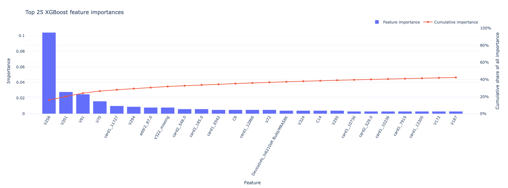
I was curious about the features, so I checked out the feature importances and did a SHAP analysis. The most important feature by far was V258, at over 0.1; the next closest were V201 and V91 and V70, at over 0.01; the rest were all lower. Good job Vesta! The highest core feature was the one-hot encoded card1_11727, followed by addr2_87.0; the highest missingness indicator was V322_missing.
Here’s a plot of the top 25:
Digging into V258 a bit more, it seems higher values are significantly more likely to be fraud:
| feature_bin | count | fraud_rate |
|---|---|---|
| (-0.001, 1.0] | 112959 | 0.0397 |
| (1.0, 2.0] | 11247 | 0.169 |
| (2.0, 66.0] | 6224 | 0.612 |
For a more human-friendly one, card4 shows Discover cards are most associated with fraud, AmEx least:
| card4 | count | fraud_rate |
|---|---|---|
| discover | 6651 | 0.077 |
| visa | 384767 | 0.035 |
| mastercard | 189217 | 0.034 |
| american express | 8328 | 0.029 |
| 1577 | 0.026 |
The SHAP plot looks like this:
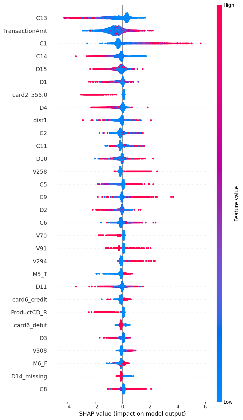
You can see, for several features, high or low values strongly pull it towards fraud or not - high C1 in particular suggests fraud, and high C13 suggests not fraud. card2_555 is very interesting; it shows a clear split, with that encoded card2 value mostly pulling predictions away from fraud.
This shows the value of SHAP; C1 isn’t even in the top 25 feature importances, and it does show higher values have a higher fraud rate, but the numbers don’t make it look as dramatic as the SHAP does:
| feature_bin | count | fraud_rate |
|---|---|---|
| (-0.001, 1.0] | 317285 | 0.025 |
| (1.0, 2.0] | 105071 | 0.030 |
| (2.0, 3.0] | 51315 | 0.036 |
| (3.0, 7.0] | 64597 | 0.048 |
| (7.0, 4685.0] | 52272 | 0.089 |
The dashboard
Notebooks are nice, but not very user-friendly, so I made a little dashboard using React and Vite, with a FastAPI backend. I’m not a front-end developer, but it was pretty painless with the help of Codex.
The Overview page compares the model stats, both with bar charts of metrics, and a Sankey (my personal favourite, probably because of my energy background).

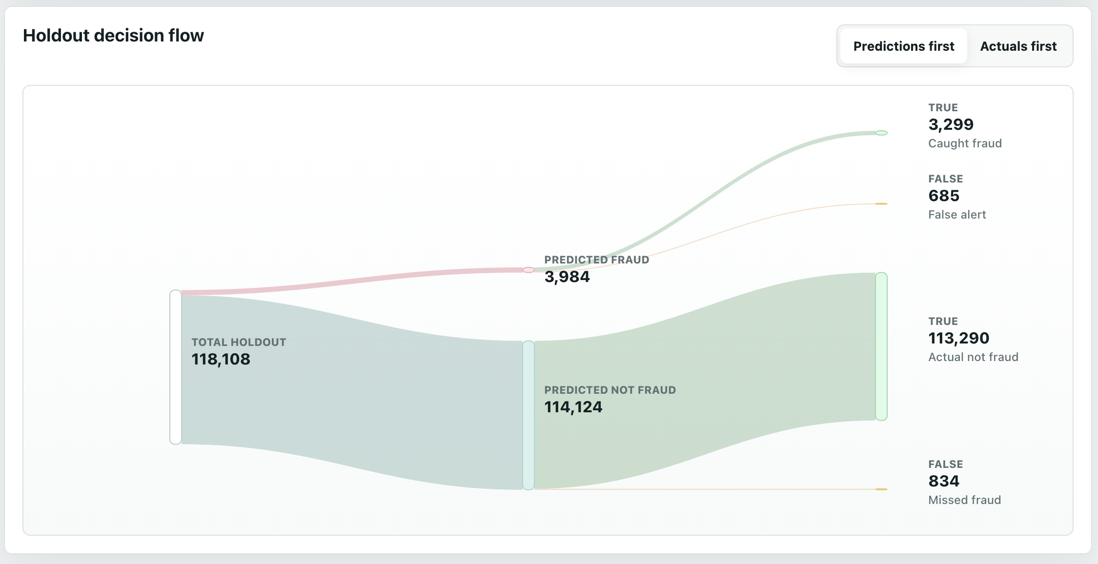
The Transactions page lets you go through each holdout row, see if it was actually fraud or not, and see how each model predicted it. The default sorting is the largest gap between the two models. I added filters and summaries for easier viewing.
The Thresholds page, as discussed earlier, shows the numbers of caught fraud, missed fraud, and false positives, for each model, at different alert thresholds.
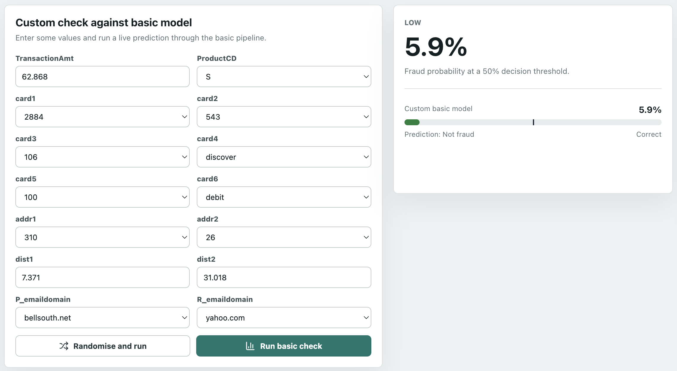
The Custom Check page is fun. Choose any values and run it through the (bad) basic model, and see how it would have predicted it - live inference! The first time it may take a few seconds to load the model. Why not the full model? Well, do you want to set hundreds of features!?
And finally, an About page, explaining the app and the features.
Learnings and conclusion
Selecting the right metrics
Even the basic model had a ROC AUC of almost 85%; if we only looked at that metric, we’d think the linear model was good. It wasn’t. This is because the negative class heavily outnumbered the positive class; remember, only 3.5% of the data was fraud. Accuracy has a similar issue: it’s “easy” to classify a non-fraud as non-fraud as they’re 96.5% of the data, so an uninformed guess would likely be correct. Recall alone can also be misleading: the basic model caught many fraud cases, but created a huge number of false positives. That’s why precision and average precision are most important in this scenario; they show how many alerts are actually fraud, which is most important with fraud.
That said, while numbers are great, as a visual person, I think the Sankey is best for comparing the models.
Selecting the right model
Having a simple model is valuable as it’s quick and easy to build, and gives you a starting baseline. However, with many missing values, masked features so we can’t inherently interpret them, and the hypothesis that many features are non-linear, a tree-based model is likely to prove superior. These can better capture thresholds, better handle interactions between features, and make good use of encoded missingness patterns.
Selecting the right threshold
As I learnt in my cyber security days, there’s always a trade-off between true and false positives and negatives; how you configure the alerting depends on business case. More false positives means more alerts to triage and likely more customer complaints. Yet more false negatives mean more severe customer complaints, and potentially legal consequences.
Interpreting the model
There’s value in both feature importances and SHAP - for this model, of the top 25 feature importances and 25 SHAP features, there was only an overlap of 5 features (and only 10 in the top 50 of each). So while 20 features had high split importance without being among the largest SHAP contributors, 20 features had large SHAP effects without being among the top split-importance features. The combined list - C14, V70, V91, V258, V294 - are ones I’d dig into deeper, especially if it was possible to unmask them.
Next steps?
The next step would not be simply chasing a higher model score - it already seems to be performing pretty well. Instead, it comes down to the business decisions on how to use it.
First, I’d define the decision policy: which scores lead to approval, step-up checks such as multifactor authentication, manual review, or blocking. This would factor in a cost-based framework - do the reduced friction and review-cost savings from being more permissive outweigh the potential costs of increased undetected fraud?
Second, calibration. Over time, as we run the model on new data, we can compare the predicted percentage to the actual percentage - for example, of those predicted to be 70-90% fraud, what percentage actually turned out to be fraud? Are they higher or lower? If so, rather than retrain the model, an extra layer could be added to the pipeline to handle this.